And, I am not talking about dynamic in the sense of technology. I do recommend trying to use some of the latest technology to make a website more engaging, but there are simple ways you can make your website more dynamic.
It always confuses me when I see a website of an artist or arts organization that falls flat. What happened? You can be more artistic in everything that you do, not just for your events, shows, performances, etc.
Here is a list of a few ways you can make your website more dynamic. Anyone can do the following:
- Make sure your fonts match what you are saying. If you are celebrating, than make sure the font looks like you are celebrating. If one of your events is a big deal in the community, the font should look like a big deal too, within reason of course.
- Fonts should not be tiny and difficult to read. Bump it up a few notches, and it will help readers to not squint and/or run from the page.
- Make sure your site is not too text heavy. Remember that websites should be “at a glance” offerings with links to “read more.”
- Pictures!!! I see many websites that do not have enough pictures to create the excitement for the pages. Seeing is believing and it has been proven that people like to see people. Add pics to each page and maybe add a gallery if you have many dynamic photos to show.
- Videos!!! I am always asking for more videos on websites. A video convinced me to see a Fringe show last weekend, so I know it works.
- Organization. Create menus that make sense and pages with links that do not have you traveling around only to find you back at the page you started from. Make sure your navigation is user friendly!
- Colors – Look and feel, make sure it matches who you are. You might need a branding session if not. Plus, consider how color can make your website more dynamic. Are the colors on your site drab and weary or fantastic and full of energy? Color is an important factor you might not want to ignore. The choices are important since there is a psychology to colors.
- Language – You can make your website more dynamic by the language you use. Flat and boring is not going to get people to the shows. Use adjectives that correctly define who you are and what your show is truly about. Skip the typical “exciting” or “fun for the entire family” and all the other cliches. Answer the questions: Why would people want to go to this show? What makes this artist, arts organization special?
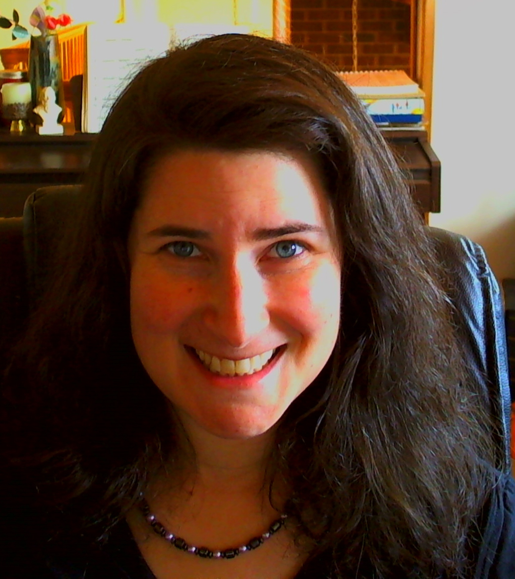
- Emotions – The arts are emotional. You can show the emotions through pictures and language. The panned serious photos are almost laughable these days. People creating the arts are not that serious (well, maybe a few are). They show a full range of emotions. Your pictures should show emotions too. Don’t be afraid to smile.
- Pages about events for audiences, such as fundraisers should have pictures of the audience! Again, people want to see people. Show that people are enjoying themselves. A picture in this sense is definitely worth a thousand words or more.
In general you want to create a site that has people wanting to click for more. Getting people to explore a website is the name of the game, and using dynamic fonts, photos, videos, language, branding, is an easy and effective way to do so. If you have any questions about your website, feel free to contact me for an evaluation, or, you can always ask your audiences.
Cheers to happy and loyal audiences,
Shoshana
Shoshana Fanizza
Chief Audience Builder
